Dreamweaver tutorial: Futureproofing your layout in Dreamweaver
What you’ll learn in this Dreamweaver Tutorial:
|
This tutorial provides you with a foundation for working with Adobe Dreamweaver layout. It is the fifth lesson in the Adobe Dreamweaver CS5 Digital Classroom book. For more Adobe Dreamweaver training options, visit AGI’s Dreamweaver Classes. |
Adobe Dreamweaver Tutorial: Futureproofing your layout in Dreamweaver
Absolutely positioning the elements of your page layout is very stable and reliable, but it also has some fundamental limitations. You have already seen what happens when there is more content than can fit inside a box: the box overflows resulting in unattractive content. You have also seen one solution, which is simply to expand the size of the box. Even this is not an ideal solution though. Content on the web changes constantly; text is added and removed, images are inserted and so on. The designer of the page may have little or no control over this, especially if they are handing a web site off to a client who will eventually be updating and modifying the site.
To help strengthen your layout for future modification you can use a CSS property called overflow. This will help you prevent the worse-case scenario of text that breaks your layout as it overflows its container. For this exercise, you’ll apply overflow to the Members Benefits sidebar.
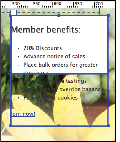
1 Click on the bottom edge of the sidebar and then drag the bottom of the box upwards until half of the list items are overflowing out of the box.
|
Text that is overflowing over the sidebar |
2 Double-click the #sidebar style in the CSS Styles panel and then click on the Positioning category.
3 Click on the Overflow menu and choose auto. This automatically adds scrollbars to any <div> element that has more text than can fit inside. Click OK. You will see in Dreamweaver’s design view that the box has snapped to fit the original height.
4 Choose File > Save, then File > Preview in Browser. Your div now has a scrollbar. While it may not be an ideal solution if you do not like scrollbars, at least it doesn’t break the layout. Close the browser and return to Dreamweaver.
The pros and cons of Absolutely Positioned CSS layouts in Dreamweaver
You will now take a look at the limitations and weaknesses of the layout you have just created. Absolutely positioned layouts in Dreamweaver are the quickest and easiest way to get a web page up and working, however, as noted earlier they are not the most flexible.
In this exercise, we hope to point out some of the limitations of Absolutely Positioned layouts so that you can judge for yourself whether they fit all of your needs or you need to be looking at the next step of creating pages using more advanced layout techniques, which are covered in Lesson: 6, “Advanced Page Layout.”
To illustrate this, you will take a look at your existing layout as if someone has asked you to make the entire container larger and switch the position of the two columns on your page.
1 In the Design view, click on the edge of your #container div to select it and in the Property Inspector, change the Width from 770 to 840. The container width expands but when adding this extra 70 pixels of space, your header and the other sections are no longer well-aligned.
Your background image is now also too narrow. This cannot be easily resolved in Dreamweaver. You would have to go back to Photoshop, resize the image, and export it again. For now, you’ll simply turn it off temporarily.
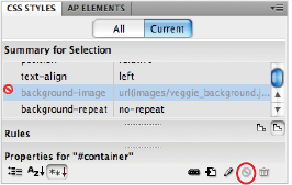
2 In the CSS Styles panel, click on the #container style, and click the Current button to see the properties. Now select the background-image property. Click on the Disable/Enable CSS Property button ( ) at the bottom of the panel to turn off this image for now.
|
Clicking the Disable/Enable CSS Property button |
With the background image temporarily removed, it is easier to see the structure of your layout.
3 Click on the right edge of the header and drag it to the right to expand the width. Drag the header beyond the container and notice it is easy to break your layout. This is because absolutely positioned elements don’t interact with the other elements on the page
In the CSS Property Inspector, set the W (Width) value of the header to 840. It must match the width of the container exactly. Although you’ll also notice that the background image of the vegetables remains flush right.
4 Click on the edge of the intro box, and, using your arrow keys, nudge it to the right until it is centered within the page.
Now you need to switch the position of the Main and Sidebar divs.
5 Click on the edge of the Main div and use your arrow keys to nudge it to the right. Notice that it overlaps your sidebar. This is due to the behavior of absolutely positioned elements allowing them to occupy the same space on the page.
The property that controls which element is highest in the stacking order is called the z-index. Dreamweaver sets this property automatically when you create AP Divs. Elements with the higher z-index value will always “win” and be visible over elements with a lower z-index. You can also modify z-index values if you choose to adjust this. |
6 Click on the edge of the Sidebar div and using your arrow keys nudge to the right until it reaches the original position of the Main div.
You may need to nudge the position of the two boxes until you are satisfied with their position. Additionally, feel free to adjust the width of the boxes if needed.
|
Switching the position of the two boxes requires you to move them manually. |
Adjusting the width of the layout and the columns within is not significantly difficult but it’s also not very efficient. Wouldn’t it be nice if expanding the width of the container automatically readjusted the columns within the new space? In fact, there are techniques you can use to accomplish this. They are called float-based layouts and you will learn these techniques in the next lesson. For now, save your file.
Congratulations, you have finished Lesson 5, “Creating Page Layouts with CSS.”
Image  | For a more in-depth look at Cascading Style Sheets see the Web Design with HTML and CSS Digital Classroom, and for a discussion of CSS3 and HTML5 see the HTML5 Digital Classroom, both of these books are available in electronic and print formats. |