Related Class
UX Typography Best Practices Improves Designs
- Published on

A focus on UX typography best practices leads to improved designs. While it’s not often that UX typography in digital products such as apps or websites can be the difference between life and death, this was the case with early user experience efforts that focused on typography. In the case of one graphic and industrial designer who was one of the first to emphasize the impact of typography on user experience, he found their relationship to be critical. The track record and approach of this designer to typography on user experience impacts millions daily in the United States. His approach to typographic problems can help UX designers working on virtually any project where typography is part of the user experience.
User experience designers are concerned with the situations in which the products they design are used. A UX designer incorporates how, when, and where their work is used. Nearly a decade ago, long before people were looking to learn UX as a specific skill set, the environmental designer Don Meeker approached a critical usability issue: the readability of public safety signs. While no swimming signs or highway signs may appear to be a long way from the work of app or website design, there are many similarities.
UX typography: a focus on readability
Meeker started his design work as a sign maker who went on to receive a master’s degree at Pratt in New York, focused on the fields of graphic and industrial design. In the 1980’s he worked on a design project for the Army Corps of Engineers in an effort to reduce hundreds of drowning deaths that occurred each year on the nation’s waterways they managed, such as the Mississippi River. By understanding the user scenarios, he utilized a critical UX design concept in his approach to the project. Rather than focusing on typical design considerations and typography concerns such as type size and font selection, he turned his focus to sign visibility in an effort to improve their readability at certain times of day. Many of those drowning were swimming at times close to sunrise or sunset, and Meeker worked with industrial paint and adhesives company 3M to include a highly reflective paint in the signs to retain their visibility even during low light conditions, creating a better user experience with a focus on typography that emphasized visibility along with readability.
User experience of typography leads to new development
The next large-scale project for the designer focused on improving road signs in Oregon for scenic routes throughout the state. Around the same time a concern for the readability of signs at night was emerging in the federal highway administration. This intersection led him to develop a new typeface for highway road signs, which he worked with type designer James Montalbano to perfect. The user experience of typography was also at the forefront of the new typeface design, as readers needed to be able to read while traveling at a high rate of speed.
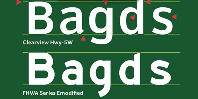
They developed the Clearview typeface as an alternative to Highway Gothic. Independent testing at Penn State found that drivers could read the signs hundreds of feet further away, and the letterforms had clearer visibility in both day and night. By focusing on the center of characters, such as the middle of the letter “o” or the cut-out portion of the lowercase “e”, areas known as “counters” in typography design, the designers were able to improve readability of the letterforms. This is evident in the visual created by Meeker which accompanies this article.
Better UX typography loses to license fees
The focus on the user experience scenario they created a better typographic solution. While it appeared that the better user experience of the typeface Clearview would make it a good replacement, it was only provisionally approved for use on federal highways. At the start of this month the provisional approval for the typeface was rescinded, despite studies showing it to be a better option for usability and safety. Because the typeface was Clearview designed independently, highway authorities and jurisdictions needed to license it. While the existing font family of Highway Gothic may have provided a less-effective UX, the no-cost license appears to be more appealing than usability. A spokesman for the Federal Highway Administration said the agency promotes the use of fonts and other items are publicly available without license fees.
About the author
Jennifer Smith is a user experience designer, educator and author based in Boston. She has worked in the field of user experience design for more than 15 years.She has designed websites, ecommerce sites, apps, and embedded systems. Jennifer designs solutions for mobile, desktop, and iOT devices.
Jennifer delivers UX training and UX consulting for large Fortune 100 companies, small start-ups, and independent software vendors.She has served as a Designer in Residence at Microsoft, assisting third-party app developers to improve their design solutions and create successful user experiences. She has been hired by Adobe and Microsoft to deliver training workshops to their staff, and has traveled to Asia, Europe, India, the Middle East, and across the U.S. to deliver courses and assist on UX design projects. She has extensive knowledge of modern UX Design, and worked closely with major tech companies to create educational material and deliver UX workshops to key partners globally. Jennifer works with a wide range of prototyping tools including XD, Sketch, Balsamiq, Fireworks, Photoshop, Illustrator, and Blend for Visual Studio. She also works extensively in the fields of presentation design and visual design.
Jennifer is also an expert on Photoshop, digital image editing, and photo manipulation. Having written 10 books on Photoshop, and having consulted and provided training to major media companies and businesses around the globe.
Jennifer is the author of more than 20 books on design tools and processes, including Adobe Creative Cloud for Dummies, Adobe Creative Cloud Digital Classroom, and Photoshop Digital Classroom. She has been awarded a Microsoft MVP three times for her work with user experience design in creating apps for touch, desktop, and mobile devices. Jennifer holds the CPUX-F certification from the User Experience Qualification Board and assists others in attaining this designation in leading a UX certification course at American Graphics Institute. She is a candidate for a Master’s degree in Human Factors in Information Design.


